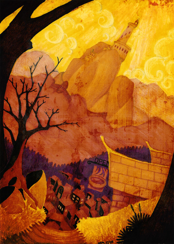
For some reason, I had this image percolating around in my head for a couple days. I figure the best way to get it out is on paper, so now you have to look at it too. I knocked this out in one evening, which is quite fast for me. I kind of like the way the dramatic lighting and forced perspective work together. Fairytale-ish with a bit of a dark edge.
Here are some nearly fascinating insights into the process behind creating this final sketch:
Inspiration – The highly original subject matter itself was cooked up out of my head. However, we recently took a family trip through the Black Hills. The lumpy granite formations and dark pine-covered hills of western South Dakota informed the general look of the landscape. I’ve been thinking bout introducing a ridiculously tall city into Detours (foreshadowing alert?) And I’m pretty sure I stole the look of the sky from the intro sequence of Kung Fu Panda. Oops.
Media – This is a hearty mix of Prismacolor markers and colored pencils, with a dash of PhotoShop added to taste.
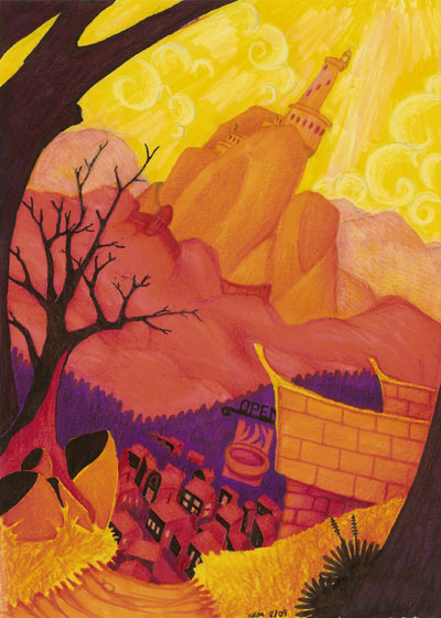
The Process – Fairly experimental. No formal planning went into the composition. I started with a pencil sketch on a loose perspective grid. Then I filled in the primary blocks of color with markers. In this case, I worked from light to dark, though that may not make much difference. I haven’t really done much work with markers, so I’m still learning the tricks to get them to do what I want. The limited color palette available is one thing that I’m still wrestling with. To get beyond the flat colors, I went back in with colored pencils, adding details, highlights and shadows. Here is a raw scan of the image at this point:

Now two things were going on here. One, I wasn’t very happy with how the colors were interacting. I hadn’t quite overcome the “box of 8” look. Two, my scanner did some strange things when interpreting the colors. The pinks streaks in the sky and the furthest hills? That’s new. The red hills and buildings? They look pinker and hotter than the original. Time to soothe things over with a little PhotoShop magic.
I didn’t have to do much. I tweaked the colors, making everything a bit more compatible. Next I added some shadowing in the lower left to balance the composition a little better. Finally, I worked in some texture to give the whole piece some grit and a sense of age.
And its just that easy!
Now you too can draw random stuff and pretend people want to look at it… 🙂
