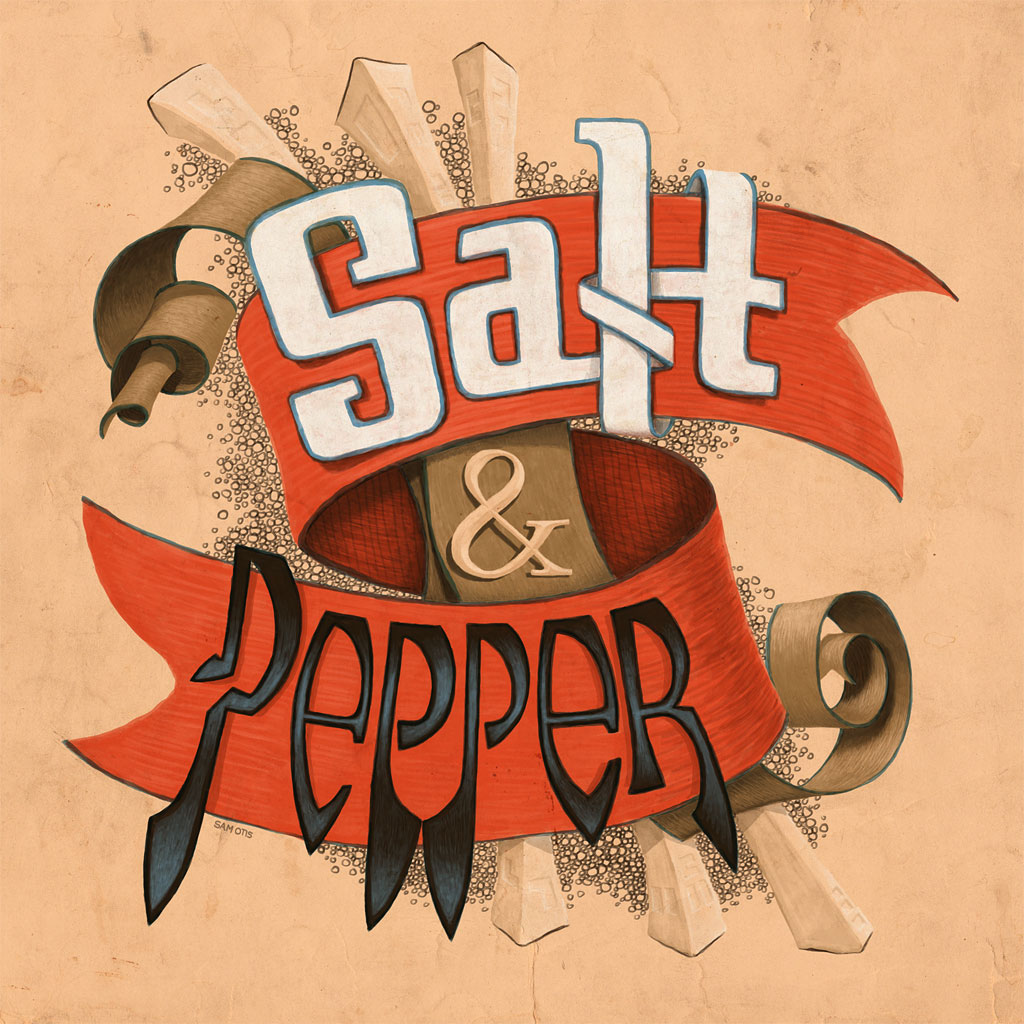
Here with another installment of Illustrating Type the Hard Way (TM). This is a completely digital sketch that grew out of some loose experimentation with letterforms. It also might be some kind of reaction to all the crisp, flat design around these days. You’ve got to mix things up, right?
Right. Mix it up Sam, that hand-drawn quality communicates so much more than übervetica. Love the connections on ‘Salt’ … both in front and behind the orange ribbon! :^)