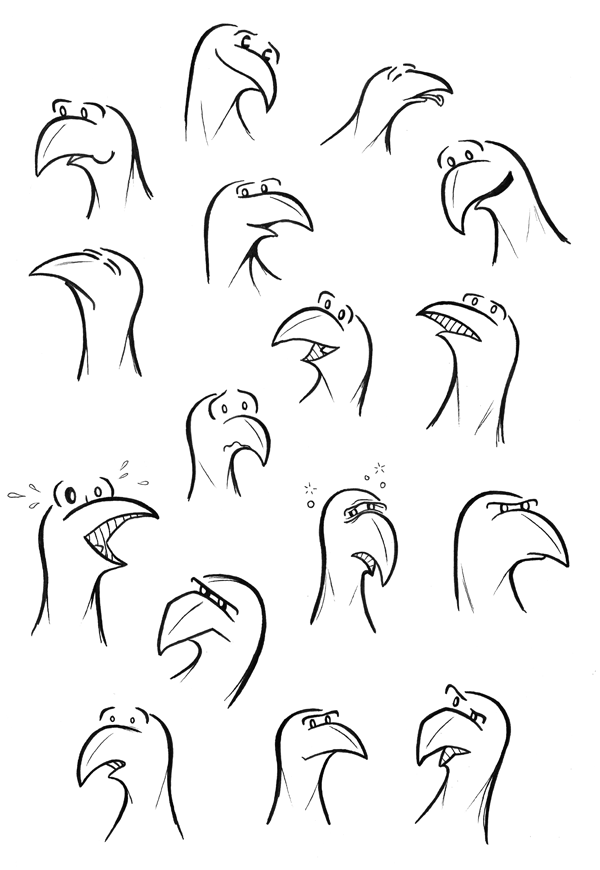
Growing up, I spent many hours pouring over Calvin and Hobbes books and trying to redraw the best/most hilarious facial expressions I could find. Sneezing, laughing, furious rage, he could do it all. How do you communicate that much emotion with so few lines? I obviously still don’t know… But one thing I do know is that facial expressions are key to bringing characters to life. Thanks to Bill Watterson, any cartoon character I draw will need to be a facial contortionist. This sketch is a few warm-up exercises. Pace yourself Zeke. You don’t want to sprain an eyebrow.
Category: Actual Sketches
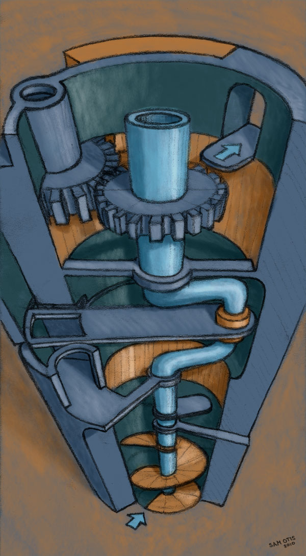
Mechanical Maze Sketch
I have been trying to find excuses to use my Wacom tablet in the hopes that I will develop some level of skill with it. Some level above zero is preferred.
This sketch was one I discovered laying around when shoveling off my desk the other day. It was originally something I worked up while brainstorming video game ideas. This was my first take on a mechanical obstacle course game concept. That’s about all the farther it got, although there may be some potential there… Anyway, I took the rough pencil sketch and dropped in some color using the tablet and some secret techniques I picked up from Tony Cliff. Now obviously this isn’t very refined. (Why didn’t I go back in and fix some of the perspective flaws?) But it was fun, and way easier than my efforts before I had the tablet.
Lets see what other sketches need some color around here…
Zeke Meets “Fine Art”
I landed myself a Wacom tablet a while back, and have been looking for time to experiment with it ever since. I am still getting the feel for it, but the potential is exciting! The above sketch was done in Painter using oil paint, and then drawn over the top with pencil. The second sketch (below) was done with chalk and then rubbed down for a smoother final product.
Gaming Levels Sketch
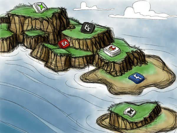
Inspired by the Web2Summit map, I was doing some more sketching with SketchBook Pro on the iPad. I am interested to see how much a specific artist’s style shows across mediums, versus, conforming to the tool at hand. I did a similar sketch a while back with literal pencil and paper. I can see my “fingerprint” in each, although this digital sketch does look like I was having to work a bit harder to find the correct lines.
Of course, the nice thing about digital is you can easily have multiple versions of the same art. Here is the same sketch with the color taken out. Read More …
First Blush: SketchBook Pro for the iPad
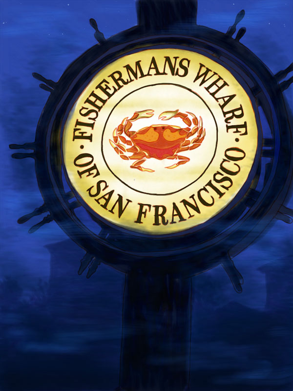
FISHERMANS WHARF OF SAN FRANCISCO (DRAWN WITH SKETCHBOOK PRO)
Ever since I got an iPad, I have been on the lookout for a good sketching app. I started with Adobe Ideas, which is a nice and simple app. It tries to balance a loose-hand drawn feel with vector-based artwork. And its free, which is always a nice feature. With all that, however, Adobe Ideas left me wanting for actual sketching purposes. It auto-simplifies your lines, and reduces things to hard edged vectors. That is fine for some applications, but I was interested in something more painterly.
A few days ago I came across SketchBook Pro by Autodesk. I figured the guys who make Maya, Inventor, and 3DS Max could put together a decent sketch program, so I coughed up the $8 and took the plunge.
Below is my very first, experimental sketch with SketchBook Pro: (the deeper meaning is obvious…)
Found Baseball Sketch
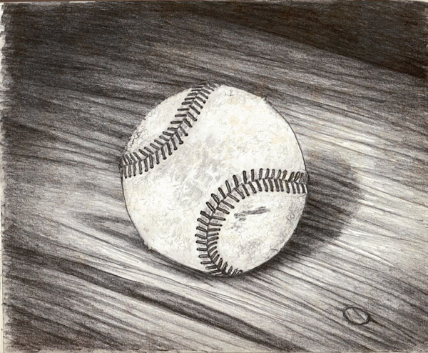
I was wandering through the park near my house the other day, and stumbled upon an old baseball someone had left in the tall grass. Rather than wait to see if a baseball tree would sprout next spring, I decided to take it home and do this sketch. I was having fun reproducing the distressed texture of the leather, when I realized my fancy drawing was basically just a circle centered on the page. Fancy, huh? All the compositional complexity of the Japanese flag. Oh, well. I like it anyway.
I also found some time to experiment in photoshop. I thought this colored version had an interesting look… Read More …
DrawnTown 14 – telephoto sketching
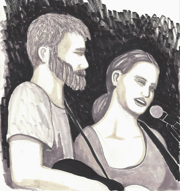
The DrawnTown crew invaded the Block Party on Eastbank on Friday. Many unsuspecting people were subsequently “arted”. Jami Lynn and Josh Rieck were providing some excellent live music, so I took aim and knocked out this quick sketch of their performance from 100 yards. From that distance, I was going for more of a rough impression rather than a refined portrait. It definitely landed in the rough category, but it was a good time non-the-less!
Isometric Island Sketch
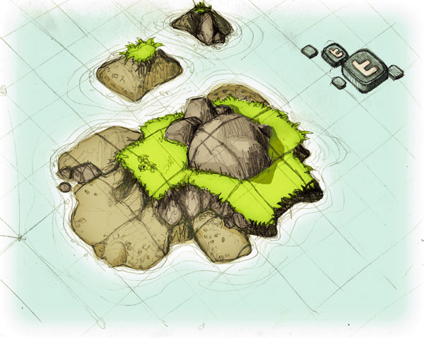
I have been drawing a lot of maps lately, and have been reminded of the joys of isometric perspective. I suppose dizziness is the appropriate response for concepts like one, two, or three point perspective, but for some reason, I have always found it fascinating.
For the uninitiated, drawing objects in perspective means using a system to mimic the way things appear to diminish in size as they get farther away. One, two, and three point perspectives use different numbers of vanishing points to help determine an object’s relative size based on perceived distance from the viewer. All this is a visual trick to represent three dimensions on a two dimensional sheet of paper or computer screen. Piccaso is quoted saying, “Art is lies that tell the truth.” Perspective is one of those lies.
Isometric perspective is different only in that it trades one lie for another. There are no vanishing points. Objects don’t diminish in size as they get further away in the scene, instead everything is locked on a parallel grid. This doesn’t match reality as we experience it, but it can prove useful in architectural renderings, or other applications where dimensions are critical. It turns out this false perspective is also useful in video games, and turns up everywhere on the web. Everything from casual games like Farmville, to the soon-to-be-released Starcraft II are built on these rules of projection.
It is easy to see the underlying grid in these screen caps:
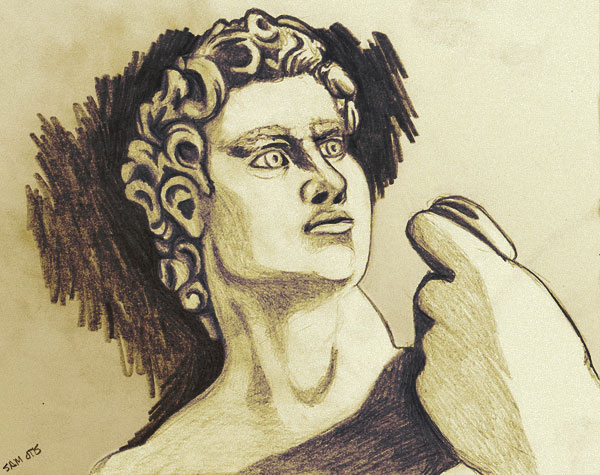
Statue of David sketch
I have never been much good at figure drawing, and this is further evidence. However, for the one year anniversary of Drawn Town, I decided to dive right in and sketch the guest of honor. The lighting was intense, and the shadows were moving fast during the event, so I’ll use that as my excuse for the lack of subtlety. Yeah, the sun was in my eyes, that was it.
For full disclosure, this was done with a plain old “2B” pencil, and then I gave it a slight sepia bump in Photoshop. Here is a link to see what other people came up with.
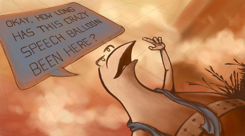
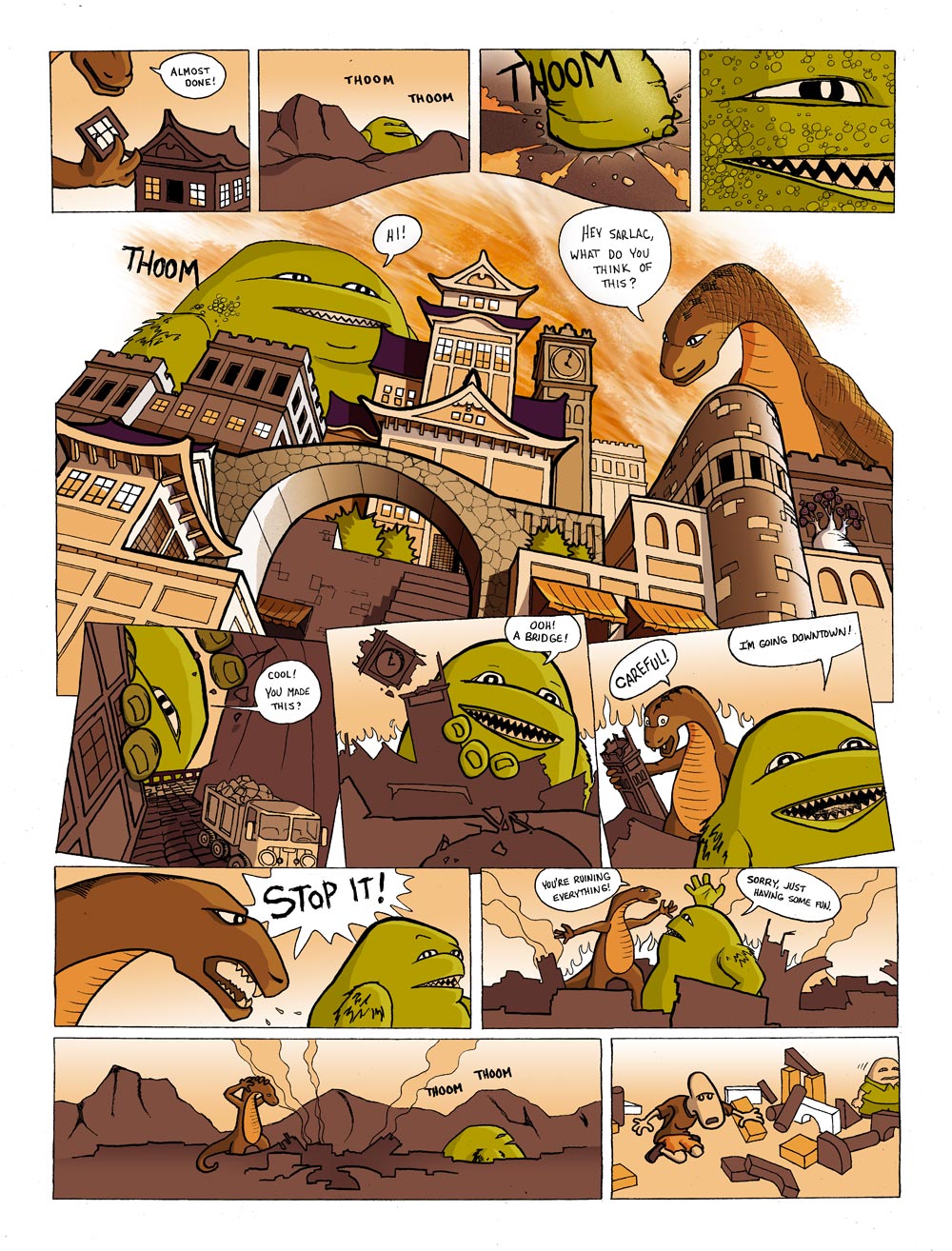
Block City Comic
In my experience, you don’t really appreciate how good someone is until you try to do something similar yourself.
Take this comic for instance. I did the actual sketch on paper weeks ago, with the style of Kazu Kibuishi’s, Copper floating around in my head. How hard can it be, right? Coloring everything in on the computer, however, ended up taking a ridiculously long time. I’m not exactly sure why it took so long, but it wasn’t till the end that I began to get any kind of rhythm going. (I totally need a Wacom Tablet!) I’m not even sure I like the final product that much. It was, however, a fun experiment, and a great excuse to draw a cityscape!
Hot tip: Click on the comic to get a larger view that is easier to read.
